Candlestick 101: A Beginner’s Guide to Reading Bitcoin Charts
If you’ve ever stared at a Bitcoin chart that moves up and down like a roller coaster and had no idea where to start—you’re not alone.
Crypto price charts can look super complicated at first. But once you get the hang of how to read them, you’ll start making investment moves based on strategy—not FOMO.
Quick Facts You Need to Know
Hide-
Bitcoin charts visualize price movement over time using formats like candlesticks and line charts.
-
Each candlestick displays Open, High, Low, Close (OHLC) in one time period.
-
Technical indicators like Moving Average, RSI, and MACD help confirm market trends and momentum.
-
Reading charts includes spotting bullish/bearish patterns and identifying support/resistance zones to guide entry and exit decisions.
Let’s break it all down in a chill, straight-to-the-point way that actually makes sense.
Get to Know the 3 Main Types of Price Charts
Line Chart: Minimalist but Kinda Meh
Line charts are the simplest version. They only show the closing price of Bitcoin at each time interval. It’s great if you just want a general overview without too much data in your face.
But here’s the catch: you won’t see the high, low, or opening prices. So yeah, it’s like the highlight reel—not the full game.
Bar Chart: More Detail, Less Vibes
Bar charts go a level deeper. Each bar shows four key numbers: Open, High, Low, Close—aka OHLC. You’ll see how the price moved within each time period.
But visually? It’s a bit dry and harder to read, especially compared to what’s next…
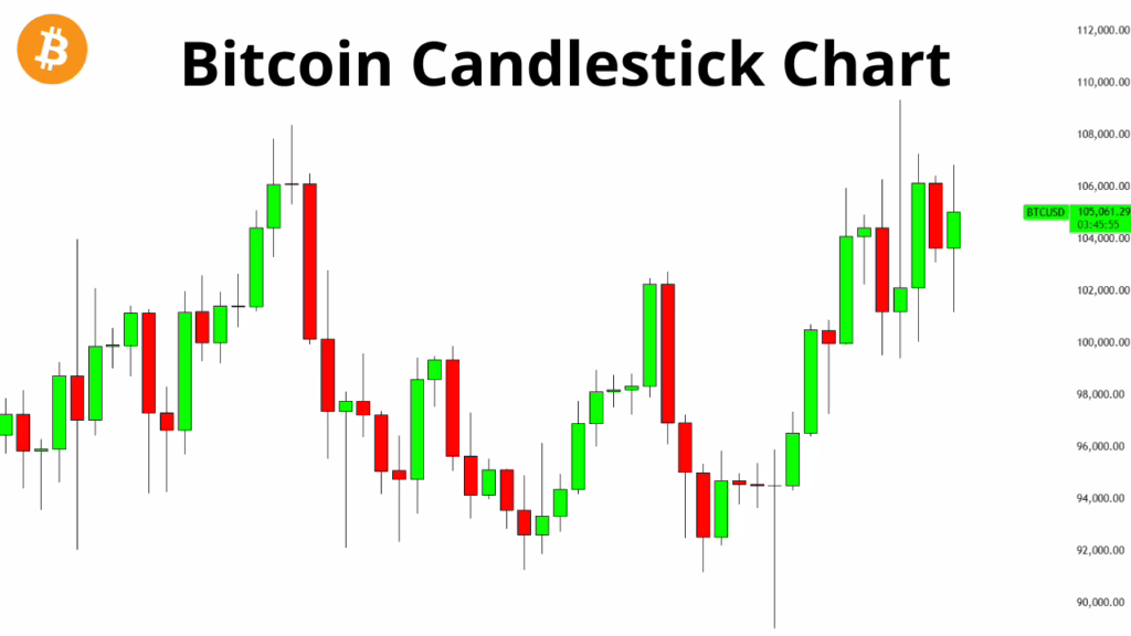
Candlestick Chart: The Crowd Favorite
Candlestick charts are where things get juicy. Each “candle” packs a mini-story about price movement in one time frame. And they look great too—clean, colorful, and packed with info.
A single candlestick shows:
| Component | What it Means |
|---|---|
| Open | Price when the period started |
| High | Highest price reached |
| Low | Lowest price touched |
| Close | Price when the period ended |
On top of that, the candle has a body and shadows (a.k.a. wicks). We’ll break those down next.
Anatomy of a Candlestick: It’s a Language, Not Just a Graphic
Candle Structure
-
Body: The space between Open and Close. If the body is big, it means price moved a lot during that time.
-
Wick (or Shadow): Thin lines sticking out above and below the body. The top shows the highest price (high), the bottom shows the lowest (low). Long wicks can signal high volatility.
Candle Colors: Red vs. Green
-
Green (Bullish): If the Close is higher than the Open. Basically, buyers won the round.
-
Red (Bearish): If the Close is lower than the Open. Sellers were in control.
So yeah, just by looking at the color, you get a quick feel for who had the upper hand that period.
Pick the Right Timeframe for Your Style
-
1–15 Minutes: For fast-paced scalpers and day traders.
-
1–4 Hours: Great for swing traders who hold for a few days.
-
1 Day–1 Week: For long-term position traders planning bigger moves.
Timeframe is a big deal. Choose wrong, and you might get misleading signals or make emotional decisions.
Technical Indicators: Tools That Keep You From Getting Lost
Support & Resistance: Where Price Flips
-
Support: Think of it as the floor. When price drops here, it often bounces back because buyers step in.
-
Resistance: This is the ceiling. When price climbs this high, sellers tend to cash out and push it back down.
For most traders, support and resistance are like GPS coordinates for where to buy or sell.
Trend Lines: Reading the Market Mood
A trend line connects the recent highs or lows to show the direction of the market—uptrend, downtrend, or sideways. It gives you a big-picture view of where things might be heading.
Drawing solid trend lines can seriously level up your trade planning.
Volume: The Secret Sauce Behind the Moves
Look at the bars below your candlestick chart—that’s volume. It tells you how many trades happened during that candle.
If price breaks out and volume spikes? That move is probably legit.
If the price breaks out but volume’s weak? Caution—could be a fakeout.
High volume = market cares. Low volume = meh.
Real-World Case: Reading Daily Bitcoin Candles
| Date | Open | High | Low | Close | Color |
|---|---|---|---|---|---|
| 2025-06-18 | 58,200 | 60,500 | 57,800 | 59,900 | Green |
| 2025-06-19 | 59,900 | 61,000 | 59,500 | 60,200 | Green |
| 2025-06-20 | 60,200 | 60,800 | 59,700 | 60,100 | Red |
What it tells us:
-
Day 1 (June 18): Big green candle. Price jumped from 58,200 to 59,900. Super strong buying pressure—a solid bullish signal.
-
Day 2 (June 19): Still green, price pushed higher but with a wick on top—some sellers took profits before close.
-
Day 3 (June 20): Small red candle. Price dipped just a little—might be a tiny correction or the start of a reversal.
If you can read the story behind these candles, you’re already miles ahead of most casual traders.
Final Thoughts: Candlesticks Speak—You Just Gotta Listen
Learning to read Bitcoin price charts isn’t about becoming a fortune-teller. It’s about spotting patterns, understanding market psychology, and knowing when to strike.
Candlesticks are basically snapshots of global trading decisions packed into tiny visuals.
If you can grasp:
-
How candlesticks work
-
What support/resistance levels tell you
-
How trend lines and volume confirm signals
…then you’re building a real foundation for smart, data-driven investing.
Remember: This is a skill you build over time—not overnight. The more charts you read, the sharper your instincts get. You’ll start noticing things most people miss, and you’ll react based on strategy—not emotion.
Keep learning. Keep practicing. Markets never stop moving, and neither should your knowledge.
If you’re looking for tools to get hands-on, try: TradingView, Binance Chart, or CoinMarketCap. Use them daily to build that muscle.
Wishing you green portfolios and wiser trades ahead!
Frequently Asked Questions (FAQs)
What’s the main difference between a candlestick and a bar chart?
Candlesticks have colored bodies that show bullish or bearish moves at a glance, while bar charts are just plain lines showing OHLC—harder to interpret quickly.
How do I choose the right timeframe?
Match it to your trading style: intraday traders use 1–15 minutes, swing traders go for 4-hour or daily charts, long-term investors look at weekly/monthly charts.
What does a long wick on a candle mean?
It means price moved far during that period, but didn’t hold. For example, a long upper wick = buyers tried pushing price up, but sellers pushed it back down.
What indicators should beginners use?
Start with Simple Moving Averages (SMA) and RSI. They’re beginner-friendly and useful for spotting trends and overbought/oversold conditions.
Is technical analysis always accurate?
Nope—no indicator is 100% right. Technical analysis gives you probabilities, not guarantees. Combine it with risk management and don’t rely on just one tool.